Sandy Beer
The Project – Launching a Female-Focused Craft Beer
The Sandy Beer journey began in 2019 as a vision that focused on how to become the first female-led, direct-to-consumer beer brand, intentionally crafted for women.
With a fiercely determined woman at the helm, who wouldn’t take no for an answer, she knew she wanted to do things differently.
Then along came Covid.
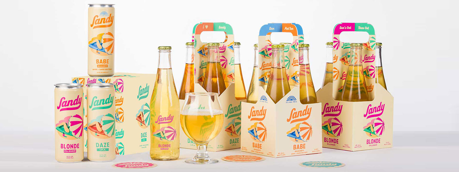
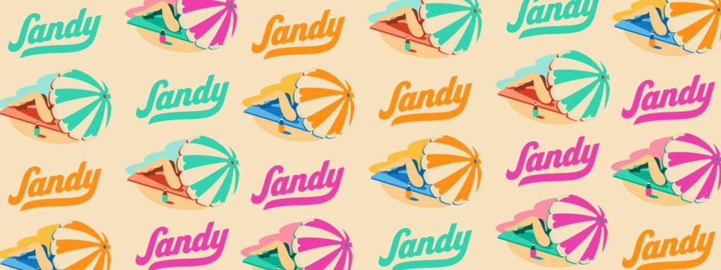
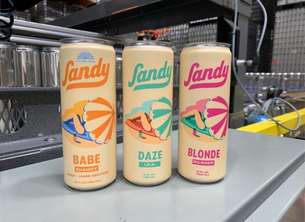
When we first met Kelly, she had her three beer styles (with really cool names) and beautiful collection of visual assets by talented illustrator and lettering designer Drew Lakin, but needed help to make her overall vision a reality.
We were hired to first manage the production process. This included sourcing glass bottles, a silk screener, bottle caps, and of course preparing all the artwork for print. As the project progressed, it was clear that much more was needed in order to bring this brand to life.
Within a span of four months, we were actively creating, sourcing and filling Sandy Beer’s first production run of bottles.
Challenges
Sourcing bottles was our first challenge.
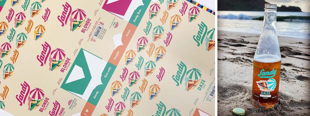
The design strategy was simple. Female-focused in every aspect of the branding from how the bottle looked, to how it felt in your hand. Standard shaped long neck beer bottles come in clear (flint) and amber glass. Amber is much more prevalent due to the UV protection and extended shelf life the amber color gives to the beer. However, the client didn’t want a standard beer bottle shape, or the amber color – so we started our search for a flint glass soda pop shaped bottle. Thanks to Google, this bottle did exist and it even had a name – it was a Continental bottle.
Ok, cool. Now we know what we are looking for. But, every glass bottle resource came up dry – no bottles in stock. We weren’t giving up – mostly because our client wasn’t giving up or willing to switch to a more available style! Before long, we found a source, and we were on our way to decorating.
Labels for this beautiful bottle were out of the question.
Silk screening was the requested decoration style. Finding a vendor that does silk screening for a small start-up bottle run was also not an easy task, but we located a vendor in Oregon. Just one slight problem, they had a 5 color max limit – and the artwork was currently 8 colors. We worked our vector magic and got the artwork down to 5 colors without compromising the original design.
Phew, challenge two averted!
Next up bottle caps.
Our client really wanted unique messages to be printed under each cap, but did you know you have to print 400,000 caps to make that happen? We opted for a beautiful dull gold crown with three different one-color imprints, each to represent the three styles of beer.
While the bottles were being screened, and the caps pad printed – we moved on to sourcing and designing a unique 4-pack carrier.
Inspired by retro milk bottle carriers, we set out to find a vendor that could bring this idea to fruition. We called upon one of our long-time box vendors to help us design this carrier. With a few rounds of trial and error, he helped us come up with a really cool solution. We were so excited about this aspect of the project, because it really set the brand apart.
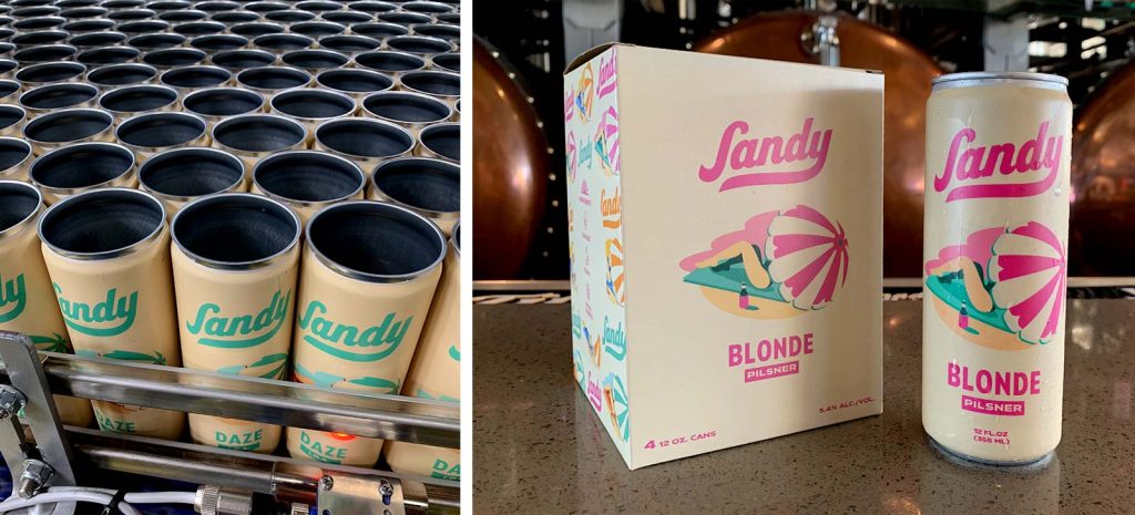
Aluminum cans were still in short supply from Covid.
Our final task for the launch was to source and design shrink sleeves for 12 oz. cans and the 4-pack boxes that hold them. The client decided upon a 12oz “sleek” can style…which is a taller and thinner shape consistent with the female-focused brand. Turnaround times everywhere were 6-8 weeks. So we got these into production as soon as possible and started on the box design.
How we helped
- Complete project management
- Beer bottle sourcing and design design
- Labeling requirements
- Unique 4-pack bottle carrier design
- 12 oz sleek can sleeve sourcing and design
- 4-pack can carrier design
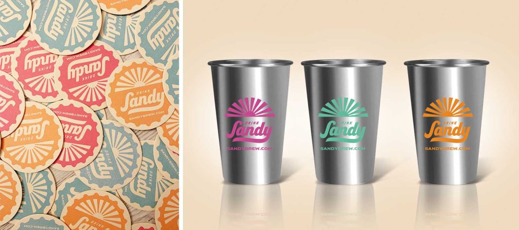
- Coaster design
- Bottle cap sourcing and design
- Marketing Collateral
Results
To build a lifestyle beer brand, one needs to have more than just impeccable design skills. It is imperative to understand the emotion and story behind the brand as well. With craft breweries springing up every week and the rush to pivot from on-premise to online, there is a unique opportunity to connect with the consumer by pushing the boundaries of design to help the brand communicate ethos and identity in an authentic way.
What started as routine package production quickly turned into a 24/7 masterclass in sourcing, supply chain, and logistics. It’s not exactly our usual design or marketing tactics, but it’s what was needed to get the job done. We learned a lot, and our client was happy and excited to launch – and that’s what matters most.
We’re also excited to announce that the Sandy Beer is a Graphic Design USA (GDUSA) Package Design Award winner!
…
The Graphic Element has experience with the production timeline required to bring food and beverage brands to market. Our expertise in branding, source packaging and vendor relationships along with design and marketing tactics provides our clients with the skills needed for a successful launch.